Color Development for Leather Bags: From Pantone to Production
- Why Leather Colour Is Harder Than It Looks
- How a Colour Reference Is Submitted
- Two Routes to Colour: Drum Dyeing and Surface Finishing
- The Colour Matching Rounds
- Lighting and Metamerism
- Colour Across a Hide and Across a Batch
- Finishing Layers and Surface Colour
- Special Effects: Patina, Pull-Up, Rub-Off and Two-Tone
- Matching Colour Across Hardware, Thread and Edge Paint
- Sampling and Approval Workflow
- When Colour Goes Wrong: Causes and Fixes
- Documenting Colour in the Tech Pack
- FAQ
A colour reference on a screen is a wish. A colour on leather is a process outcome, and the gap between the two is where most colour arguments between brands and factories begin.
Leather is not a uniform substrate. It is a natural material with varying fibre density, varying thickness and a surface that may be dyed through, coated, or both. The same dye applied to two hides produces two slightly different results, and the same hide can look different in two rooms.
None of that makes accurate colour impossible. It makes it a process: choose a reference that exists physically, decide whether colour will come from the dye bath or from the finish, run matching rounds under controlled light, and define in writing how much variation is acceptable.
Why Leather Colour Is Harder Than It Looks
Colour on leather behaves differently from colour on paper or fabric, for reasons that are structural rather than cosmetic.
The Substrate Varies From Hide to Hide
Raw hides differ in age, breed, nutrition and the position on the animal. Fibre density affects how deeply dye penetrates and how much pigment sits on the surface, and both change the final shade.
A single hide also varies internally. The back and shoulder are dense; the belly and flanks are looser and usually absorb more dye. Two panels cut from different areas of the same hide can read as two different colours once finished.
Colour Comes From Two Different Places
Leather can take its colour from the dye bath, from a surface finish, or from a combination of both. Each route produces a different character and a different set of variation risks.
Dye-through colour looks natural and ages with the material, because the colour is inside the fibre. Surface colour gives precise, repeatable shades and better coverage of hide defects, but it behaves like a coating: it can crack, wear at high-friction points, or look flat.
Perception Changes With Light and Surface
A finish with higher gloss reflects more light and reads darker and more saturated. A matte finish of the same colour reads lighter and softer. Neither is wrong, and both will be judged differently by a buyer looking at a photograph.
Ambient light matters just as much. Leather that matches perfectly under daylight can look noticeably different under warm store lighting or on a phone screen. Colour approval therefore needs a defined light condition, not simply "looks right".
How a Colour Reference Is Submitted
Colour development starts with a reference, and the quality of that reference determines how many rounds the project will need.
Physical Swatches Beat Digital Files
Screens, printers and colour profiles all shift shades. A digital file is useful for design discussion but useless as a production reference, because two monitors will never agree.
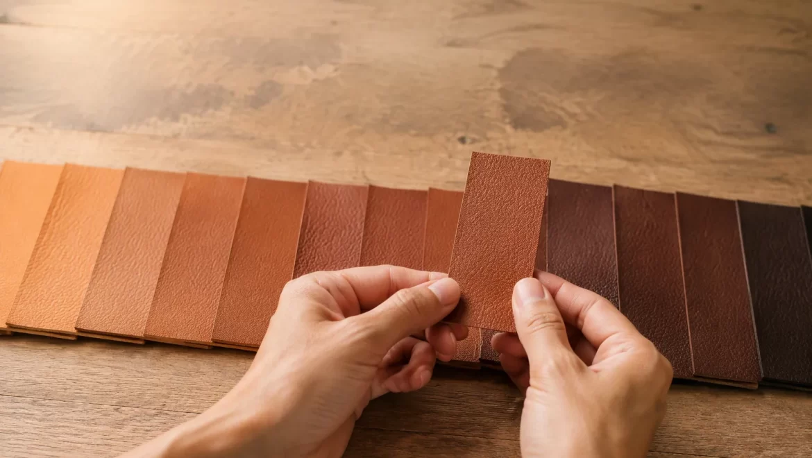
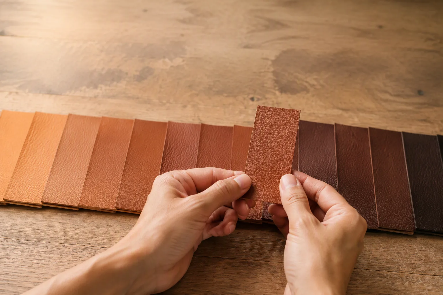
Every colour brief should carry a physical reference: a standard colour swatch from a recognised colour system, a competitor product in the exact shade, or a previously approved leather sample. Where only a digital reference exists, the first step is to have a physical swatch matched to it and approved before development continues.
Reference Systems and Their Limits
Standardised colour systems, including the Pantone range and its leather and textile variants, exist precisely to remove ambiguity. They work well as a starting point and poorly as an absolute target, because a colour system is calibrated on coated paper, not on leather.
The practical approach is to use the standard reference to communicate intent, then approve a physical leather swatch as the master standard. Production is measured against the leather standard, not against the paper chip.
| Reference type | Best use | Limitation |
|---|---|---|
| Digital file or image | Early design discussion | Screen and profile shift, unusable for production |
| Paper colour chip | Communicating intent, ordering | Calibrated on paper, not leather surface |
| Leather swatch from supplier | Development starting point | May vary by batch and dye lot |
| Approved leather sample | Master production standard | Requires controlled storage to stay valid |
One Reference Per Colour and Material
A single colour reference cannot cover multiple materials. The same target colour will behave differently on smooth grain leather, suede and coated split, and each needs its own approved standard.
Where a range uses one colour across several materials, plan for one approval per material, and expect the suede version to match less precisely than the smooth version because of its surface behaviour.
Two Routes to Colour: Drum Dyeing and Surface Finishing
Almost every leather bag colour is produced by one of two routes, or by a deliberate combination of them. Knowing which route a project uses explains most of its variation, cost and durability behaviour.
Drum Dyeing: Colour Inside the Fibre
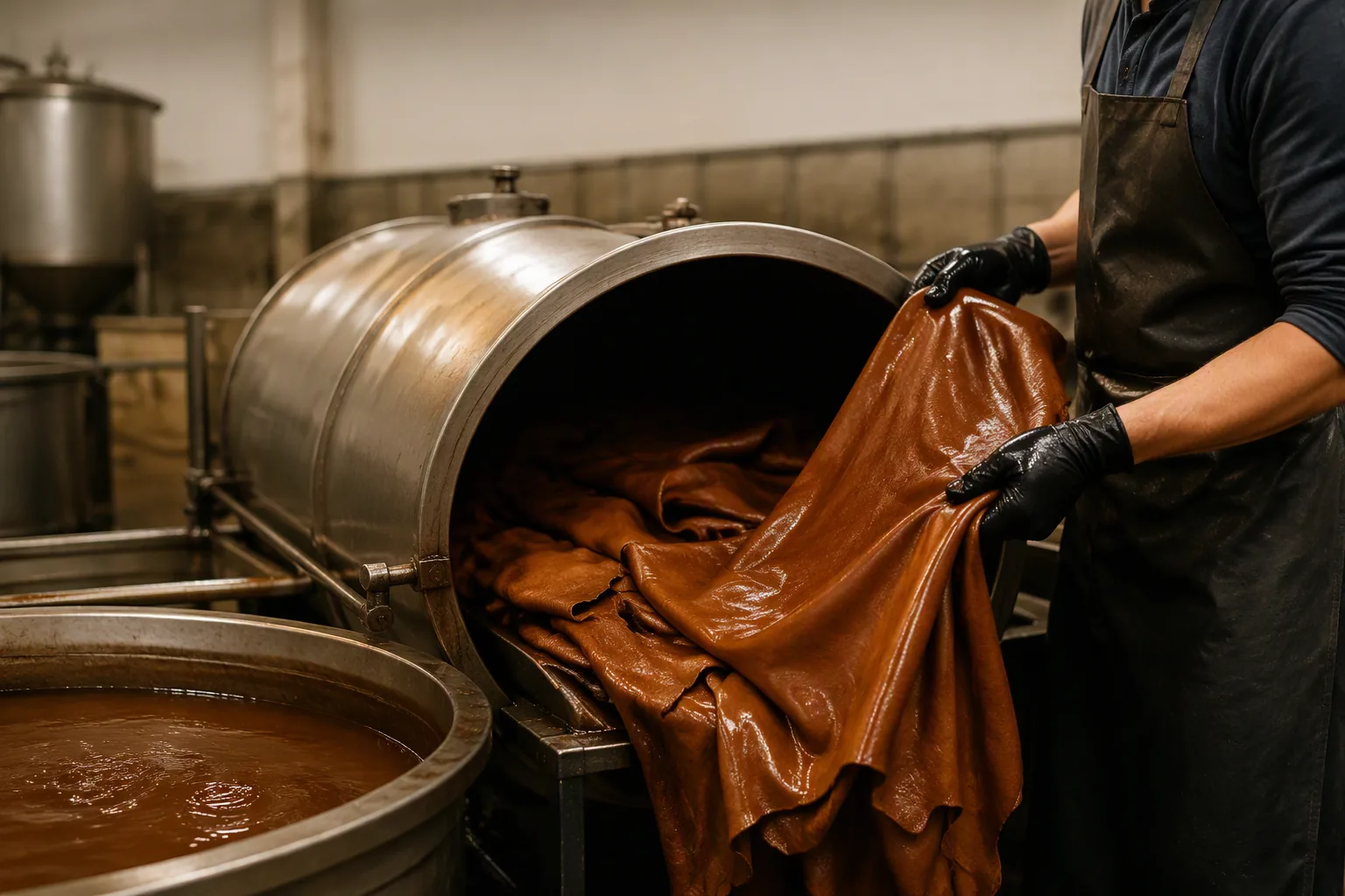
Drum dyeing takes place during tanning and retanning, when the hide is tumbled in a dye bath and the colour penetrates the fibre structure. The result is colour that goes through the material rather than sitting on it.
The advantages are natural appearance, good depth of shade, and tolerance of surface wear, since scuffing exposes more of the same colour. The limitations are lower precision, limited ability to hide hide defects, and slower changeover between colours in the drum.
Surface Finishing: Colour on the Surface
Surface finishing applies pigment or dye in coatings after the leather is dry. It can produce very precise colours, cover grain defects and deliver effects such as metallic, pearlescent or high-gloss surfaces.
The trade-off is that the colour is now a layer. It can wear at friction points, crack if the coating is not flexible enough for the material's movement, and respond differently to cleaning.
| Route | Precision | Wear behaviour | Best suited to |
|---|---|---|---|
| Full drum dye, aniline finish | Lower | Ages with the material, scuffs blend | Natural, premium, soft leathers |
| Drum dye plus light finish | Medium | Good, light surface wear | Most everyday bags |
| Pigmented surface coating | High | Coating wear visible at edges and corners | Consistent fashion colours, corrected grain |
| Coating over corrected grain | High | Coating wear, emboss pattern intact | Volume programmes, uniform colour |
How to Choose the Route
Choose the route from the product's position and use. A premium natural-looking bag with visible grain suits dye-through colour. A fashion programme requiring an exact seasonal shade across large volumes suits a pigmented finish.
Where a design intends the leather to develop a patina over time, the dye route should be chosen deliberately, because a heavy pigment coating prevents the material from ageing at all.
The Colour Matching Rounds
Colour is matched in rounds, and each round costs time. Reducing the number of rounds is mostly a matter of submitting a better brief.
Lab Dip, Sample, Production
Development usually moves through three checkpoints. The lab dip is a small piece produced to demonstrate the achievable colour. The sample round applies that colour to the actual bag materials. Production applies it to the full run.
Each checkpoint can shift colour slightly, because the substrate changes. Approving a lab dip and assuming the sample will match is the most common source of disappointment in colour development.
What Triggers Another Round
A round should repeat when the difference is visible under the agreed viewing conditions, when the finish route changed, or when the material supplier changed. It should not repeat for differences that disappear under controlled light.
Where a brand rejects a swatch on a phone screen or in a badly lit office, the round is wasted for reasons unrelated to the leather. Set the viewing condition first, then judge.
How Many Rounds to Expect
Two to three rounds is normal for a custom colour on standard material. Four or more usually signals an underspecified reference, an unusual finish effect, or a target that is simply hard to achieve on leather.
Where a target proves difficult, the practical solution is usually to adjust the target slightly rather than to keep pushing the supplier. A small shift toward achievability often removes two rounds without affecting the product's commercial appeal.
| Round | Output | Typical duration | Main risk |
|---|---|---|---|
| Lab dip | Small dyed piece | Days | Substrate differs from final material |
| Material swatch | Colour on actual leather | One to two weeks | Finish layer changes shade |
| Full sample | Colour on the assembled bag | Sample cycle | Light and surface read differently on seams |
| Production | Batch colour | Production lead time | Batch-to-batch drift |
Lighting and Metamerism
Two colours can match under one light and differ under another. This effect, called metamerism, is the single most common reason a buyer and a factory disagree while both are correct.
Define the Viewing Condition
Approval should happen under a defined light source, ideally a neutral daylight-equivalent viewing condition in a booth or a north-facing daylight situation at the same time of day. Notes should record what was used.
Natural daylight is the best general reference for leather, because the product will mostly be seen outdoors or in mixed light. Judging colour under a warm office lamp biases the result toward yellow.
Why Metamerism Happens
Metamerism arises when two colours are built from different pigment combinations that happen to reflect the same overall light under one source but not under another. A pigmented match to a drum-dyed reference is a classic case.
The effect cannot be eliminated entirely when routes differ. It can be reduced by matching pigment chemistry as closely as possible, and managed by agreeing which lighting condition governs approval.
Screen and Photograph Reality
Product photography adds another layer of distortion. Camera white balance, post-processing and the viewer's screen all shift the shade. A colour that is faithfully matched on the bench can look wrong on a marketplace listing.
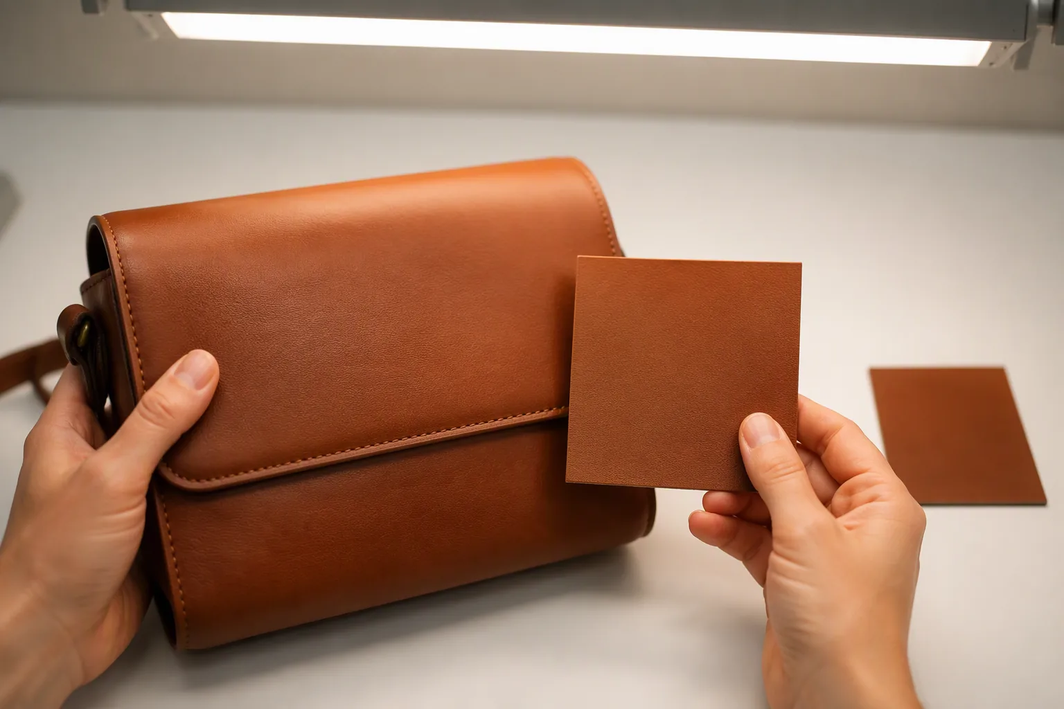
Where colour accuracy matters commercially, photograph beside the master swatch in the same frame. The swatch anchors the shade for anyone viewing the image, whatever their screen does.
| Viewing condition | Typical bias | Practical use |
|---|---|---|
| Neutral daylight equivalent | Least biased | Primary approval condition |
| Warm indoor lamp | Yellow and red shift | Simulates evening retail |
| Cool fluorescent | Green shift | Simulates office and warehouse |
| Phone screen in daylight | Blue and contrast shift | Not suitable for approval |
Colour Across a Hide and Across a Batch
A bag is not made from one square centimetre of leather, and its panels rarely come from the same area. Controlling colour means controlling variation at two scales: within a hide and between batches.
Within-Hide Variation
Dye uptake varies with fibre density. The back and shoulder are tight and take colour evenly; the belly, flanks and neck are looser and often absorb more, reading darker or more saturated.
For visible panels, cut from consistent areas. A bag whose front and flap come from dense areas and whose side panels come from the belly will show shade differences that no amount of careful production can remove.
| Hide area | Fibre character | Colour behaviour | Recommended use |
|---|---|---|---|
| Back and shoulder | Dense, tight | Even, most consistent | Front panels, flaps, straps |
| Butt | Dense | Consistent, slightly firmer | Base, structure parts |
| Belly and flank | Loose, stretchy | Darker, more variable | Interior, hidden panels |
| Neck and shoulder edges | Irregular | Blotchy, uneven uptake | Small parts, avoid on face |
Between-Batch Variation
Each dye lot has its own shade, and small differences are normal in leather. The question is not whether variation exists but how much is acceptable and how it is detected.
The practical control is to keep the approved master swatch and compare every incoming batch against it under the agreed light. Where a batch falls outside the tolerance, the choice is to accept it for a less visible part, return it, or adjust the range's colour standard deliberately.
Setting a Realistic Tolerance
Tolerance should reflect both the material and the product. A large soft tote made from natural leather can carry more visible variation than a small structured bag with a large uninterrupted front panel.
Where a programme runs over many months, drift accumulates. Recording the shade of each batch against the master standard gives an early warning before the colour has moved far enough to be obvious on a shelf.
Cross-Referencing Panels and Trims
Zips, webbing, edge paint, thread and lining all carry colour too, and none of them is dyed like leather. Each has its own tolerance, and the composite result is what the buyer sees.
Where a bag uses leather, edge paint and thread in the same colour, the practical approach is to match the edge paint most closely to the leather, and to accept that thread will read slightly differently because of its sheen and fineness.
Finishing Layers and Surface Colour
Once colour sits on the surface, the finish system determines how it looks, how it wears and how it responds to cleaning.
Base Coat, Colour Coat, Top Coat
A typical finish system applies a base coat for adhesion and filling, a colour coat carrying the pigment, and a top coat providing protection and the final gloss level.
Each layer changes the visual result. Increasing pigment concentration deepens the colour but can make it look flatter. Increasing the top coat gloss darkens the perceived shade without changing the pigment recipe at all.
Gloss, Depth and Perceived Saturation
Two samples with identical pigment can be judged as different colours if their top coats differ. A high-gloss top coat reads darker and richer; a matte top coat reads lighter and drier.
Because of this, colour approval must fix the finish level at the same time as the shade. Approving a colour on a matte sample and producing it in gloss effectively changes the colour, even though the recipe is unchanged.
| Finish level | Effect on perceived shade | Wear appearance | Typical use |
|---|---|---|---|
| High gloss | Darker, more saturated | Fine scratches visible | Dress bags, evening styles |
| Satin | Close to true shade | Moderate wear visibility | Most everyday bags |
| Matte | Lighter, softer | Wear blends, dust visible | Natural and casual ranges |
| Oiled or waxy | Darker, uneven by design | Patina develops | Heritage styles |
Plating and Embossing Effects
Plating and embossing change how light interacts with the surface. A plated grain has a directional sheen that makes the colour read slightly different depending on viewing angle, which is normal rather than a defect.
Where a range combines plated and unplated panels in the same colour, expect the plated version to look darker in some lights. This should be checked on the assembled sample, not on flat swatches.
Special Effects: Patina, Pull-Up, Rub-Off and Two-Tone
Some colours are designed to change. These effects are deliberate and must be specified as such, or they will be treated as defects at inspection.
Pull-Up and Oiled Leathers
Pull-up leathers lighten where they are stretched or folded, because oils and waxes move within the fibre. The effect is a function of the finish recipe, not of the colour.
The appearance changes with handling and develops over time. Buyers should be told this explicitly, because a pull-up bag that lightens at the handle can otherwise be returned as a colour fault.
Rub-Off and Two-Tone Finishes
Rub-off finishes are built with a contrasting base colour beneath a surface layer, so that wear reveals a second shade at edges and folds. The effect is intentional and usually concentrated where the bag is handled.
Two-tone designs achieve a similar look by design rather than by wear. Both require the sample to be approved as a whole, because judging flat swatches will not show how the contrast reads on constructed edges.
Patina and Natural Darkening
Vegetable-tanned and lightly finished leathers darken with exposure to light and handling. The rate depends on the tannage, the finish and the environment.
Where patina is part of the product's appeal, the brief should say so, and the sample should be presented with a note on how the colour is expected to move. Where it is not intended, the finish must be specified to resist it.
| Effect | Mechanism | Buyer expectation | Specification note |
|---|---|---|---|
| Pull-up | Oils and waxes move under stress | Lightens with use | State as intended behaviour |
| Rub-off | Contrast base under surface coat | Reveals second shade at edges | Approve assembled sample |
| Two-tone | Two colours by construction | Fixed contrast | Specify panels individually |
| Patina | Natural darkening over time | Deepens and softens | State expected direction |
Matching Colour Across Hardware, Thread and Edge Paint
A bag reads as one colour, but it is assembled from materials that are coloured by completely different processes. Coordination matters as much as the leather shade itself.
Metal Hardware
Hardware cannot be colour-matched to leather in any meaningful sense, because metal finishes reflect light rather than absorb it. The choice is between complementing the leather and contrasting with it.
Warm brown leathers generally pair with brass and antique gold tones, while cooler leathers pair with nickel or gunmetal. Where a metallic finish is chosen for contrast, the design should make the contrast deliberate rather than accidental.
Thread
Thread colour is chosen from a limited range of shades, and its sheen differs from leather. A thread intended to disappear should be matched to the leather's mid-tone rather than its lightest point, since slight differences become obvious on curves.
Contrast stitching is a design decision and should be specified as such, with the thread reference recorded alongside the leather reference. Where both are specified by name, the sample can be judged properly.
Edge Paint and Edge Finish
Edge paint is applied as a liquid and cures to a film, so it reads slightly glossier and slightly darker than leather in the same nominal colour. Where edges are burnished rather than painted, the colour comes from the leather itself and tends to be darker.
The practical rule is to match edge paint to the leather's mid-tone and to accept that edges will read slightly deeper. Pushing the edge paint lighter to compensate usually produces a visible mismatch on the finished bag.
| Component | Colour source | Matching behaviour | Practical approach |
|---|---|---|---|
| Leather body | Dye plus finish | Master reference | Approve physical swatch |
| Edge paint | Pigmented liquid film | Slightly darker and glossier | Match to mid-tone |
| Thread | Dyed filament | Sheen differs, limited range | Match to mid-tone or specify contrast |
| Lining | Dyed fabric | Reads differently from leather | Approve separately |
| Zipper tape | Dyed woven tape | Common mismatch point | Specify by reference, verify on sample |
Sampling and Approval Workflow
Colour approval is a controlled process, and its value depends on who approves, what they look at, and what is recorded.
Who Approves and How
One named person should hold colour approval authority, and their decisions should be recorded. Where several stakeholders review colour separately, each will judge under different light and at different times, producing contradictory feedback.
Approval should happen at a fixed stage: on the material swatch for colour, and on the assembled sample for how colour reads across seams, edges and hardware.
How Many Swatches to Keep
Keep at least two approved swatches: one master standard retained by the brand, and one retained by the factory. Both should be stored under the same conditions, so that a comparison between them remains meaningful.
Where a programme runs across multiple suppliers, each supplier needs its own approved swatch, since each will produce a slightly different interpretation of the same target.
Rejection Criteria Written Down
The specification should state what makes a batch unacceptable: how far from the standard, under which light, judged by whom. Without that, rejections become subjective and rework becomes a negotiation.
A simple written tolerance statement, tied to the master swatch and the agreed viewing condition, removes most of that ambiguity and makes batch acceptance faster for everyone involved.
Colour Continuity Across Seasons
Where a colour carries over from one season to the next, the previous master swatch must be retained. Relying on memory or on a photograph produces a quiet drift in which each season is slightly different from the last.
Retaining the standard and re-approving it once a year is a light process that keeps a core colour genuinely consistent over the life of a product line.
When Colour Goes Wrong: Causes and Fixes
Colour problems arrive in a small number of recognisable patterns, and each points to a specific stage of the process.
Uneven Shade Across the Bag
Panels cut from different areas of a hide, or from hides of different fibre density, finish at slightly different shades. The cause is the material rather than the dye recipe.
The fix is a cutting rule: allocate dense areas to visible panels and looser areas to interior and hidden parts. Where the design leaves no hidden area, the hide selection must be tightened before production, not after.
Crocking and Colour Transfer
Crocking is colour transferring from the leather to whatever touches it. It appears with heavily pigmented finishes, with insufficient drying or curing between coats, and with dye that was not fully fixed in the drum.
The fix is process-side: proper fixation, adequate drying, and a top coat that seals the pigment. Where crocking appears only after a few days of use, the cause is usually incomplete curing rather than the recipe.
Shade Drift Between Batches
Small differences between dye lots are normal, but progressive drift over months is not. It usually means the standard swatch was not retained, or production moved to a different tannery without a fresh approval round.
The fix is documentation: keep the master swatch, compare each batch against it, and re-approve deliberately when a change is necessary rather than absorbing it by accident.
| Problem | Typical cause | Fix |
|---|---|---|
| Uneven shade on assembled bag | Mixed hide areas on visible panels | Cutting rule and hide selection |
| Colour transfer to clothing | Under-cured finish, unfixed dye | Fixation, drying, sealing top coat |
| Gradual shade drift | Standard not retained, supplier changed | Keep master swatch, re-approve |
| Edges darker than body | Edge paint over leather tone | Match to mid-tone, accept deeper edge |
| Fading on display | Light exposure of light-fastness-limited finish | Specify light stability for retail |
Documenting Colour in the Tech Pack
Colour survives production only when it is written down, and the tech pack is where that happens.
What the Colour Page Should Carry
A colour specification page should state the reference used, the physical swatch identification, the colour route, the finish level, the approved material for each component, and where each standard is stored.
Where a bag uses several colours, each should occupy its own line with its own approved swatch reference. Grouping colours on one row invites substitution.
Recording Rounds and Decisions
Each matching round should be logged with the date, the sample identification, the result and the decision. This record answers the most common dispute in colour work: whether a shade was ever approved.
Retaining the rejected rounds matters as much as retaining the approved one. They show which direction the colour moved and make it possible to explain a change to a supplier or a buyer later.
Handover and Continuity
Where a product moves from one supplier to another, or from one season to the next, the colour page and the master swatch are the handover. A new supplier given only a photograph will produce their interpretation of a photograph.
A short handover note listing the reference, the route, the tolerance and the storage location is enough to keep the colour stable across suppliers and across years.
FAQ
Why can't I just send a digital colour file to the factory?
A: Screens, printers and colour profiles all shift shades, so a digital file cannot be used as a production reference. Send a physical swatch or a standard colour chip, then approve a leather swatch as the master standard.
Does a Pantone reference guarantee the leather colour?
A: No. Standard colour systems are calibrated on coated paper. They communicate intent well, but production should be measured against an approved leather swatch, not against the paper chip.
What is the difference between drum dyeing and surface finishing?
A: Drum dyeing puts colour inside the fibre, so wear reveals a similar tone and the leather ages naturally. Surface finishing puts colour in a coating, giving greater precision and defect coverage but showing coating wear at edges.
How many colour matching rounds should I expect?
A: Two to three is normal for a custom colour on standard material. Four or more usually means the reference was underspecified, the effect is unusual, or the target is difficult to achieve on leather.
Why does the colour look different in my office than at the factory?
A: Different light sources reveal different aspects of a colour, and metamerism makes two matching colours differ under a third light. Agree a neutral daylight-equivalent viewing condition and judge only under it.
What is metamerism in leather colour?
A: It occurs when two colours are built from different pigment combinations that match under one light source but not another. It is common when a surface-coated match is compared with a drum-dyed reference.
Why do the edges look darker than the bag?
A: Edge paint is a pigmented film that cures glossier and slightly deeper than leather, and burnished edges take colour from the leather itself. Match edge paint to the leather mid-tone rather than pushing it lighter.
Should thread match the leather exactly?
A: Not always possible, because thread has a different sheen and a limited shade range. Match it to the leather mid-tone if it should disappear, or specify a contrasting thread deliberately.
How much colour variation between batches is acceptable?
A: It depends on the material and the product. A large soft tote can carry more visible variation than a small structured bag with one uninterrupted front panel. Set the tolerance in writing against the master swatch.
What causes colour transfer onto clothing?
A: Crocking usually comes from a heavily pigmented finish, incomplete drying or curing between coats, or dye that was not fully fixed in the drum. The fix is process-side rather than a different recipe.
Why does the same colour look different on suede?
A: Suede has a raised fibre surface that absorbs and scatters light differently from smooth grain. It needs its own approval, and it will generally match less precisely than a smooth leather.
What is pull-up leather, and is the lightening a defect?
A: Pull-up leathers contain oils and waxes that move when the material is stretched, so the surface lightens at folds and handles. It is intended behaviour and should be stated to buyers.
How should I store a master colour swatch?
A: Flat, in the dark, sealed, and away from handling. Leather swatches fade and absorb oils, so standards should be checked periodically and replaced with verified duplicates when they age.
Can colour be matched exactly across leather, lining and zipper?
A: Rarely exactly, because each material is coloured by a different process. Approve each component separately, and accept small differences that are invisible on the assembled bag.
How do I stop a core colour drifting over seasons?
A: Retain the master swatch, keep the colour page in the tech pack, and re-approve the standard once a year. Relying on memory or photographs allows quiet drift season after season.
What is the most common cause of wasted colour rounds?
A: Rejecting a swatch judged outside the agreed viewing condition, or on a screen. Setting the light, the judge and the tolerance before the first round removes most wasted cycles.
Ready to run a colour development that lands in fewer rounds and holds over repeated batches? Submit a physical reference, fix the finish level before judging shade, agree the viewing condition in writing, and record an approved leather swatch as the master standard for production.